Ignition LLC Brand Refresh
Ignition LLC Brand Refresh Case Study
Client Overview
Ignition LLC, founded by growth strategist Jeff Pugel, specializes in transforming service-based businesses through strategic marketing and scalable lead generation. With over 25 years of experience, Jeff has successfully worked with both startups and major corporations, bringing innovative, data-driven strategies to clients eager to escape founder-led sales models and build sustainable, efficient growth systems.
The Challenge
Before the brand refresh, Ignition LLC’s visual and messaging framework did not adequately communicate the energy and sophistication of its services. Jeff’s expertise and transformative methods needed to be matched with a compelling and cohesive brand identity that resonated with ambitious, analytically-minded business owners.
Project Objectives
- Develop a comprehensive logo suite and visual identity that embodies professionalism, energy, and the concept of ignition.
- Position Ignition LLC as the ultimate partner for businesses seeking to scale strategically and achieve consistent, high-value growth.
- Ensure the brand conveys both trust and innovation, capturing the spirit of ambitious entrepreneurs and service-based professionals.
The Brand Transformation
1. Brand Concept and Visual Identity
The new brand concept is inspired by the themes of data, charts, and directional arrows—symbols that convey movement, direction, and informed decision-making. This aligns with the brand name Ignition, suggesting a powerful start and upward trajectory. The design embodies the dynamic energy of growth, combining professionalism and structure, which resonates with Jeff’s target audience of seasoned executives and business leaders. The visual language is crafted with a clean, modern aesthetic, integrating bold, engaging elements that convey both stability and action.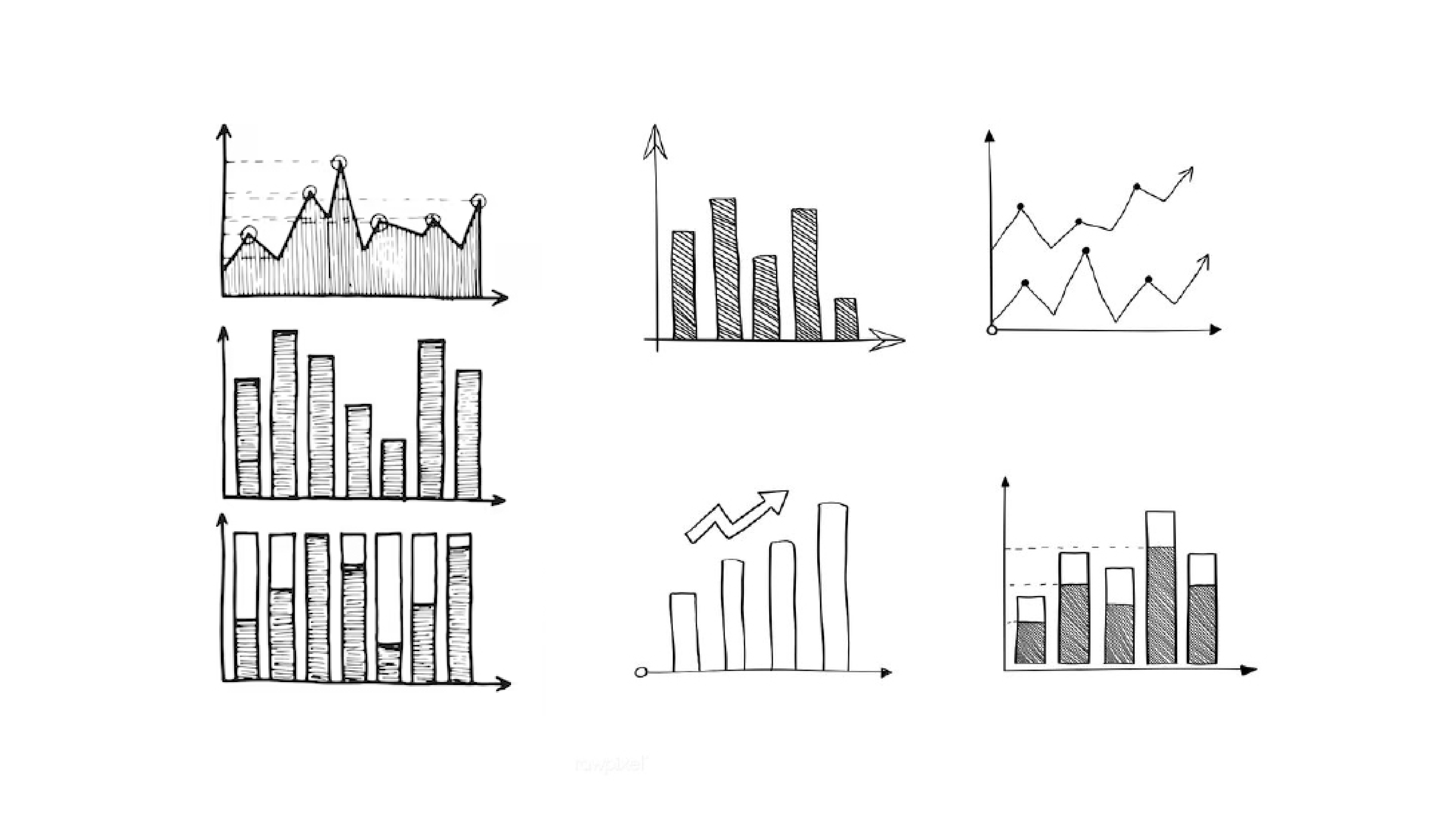

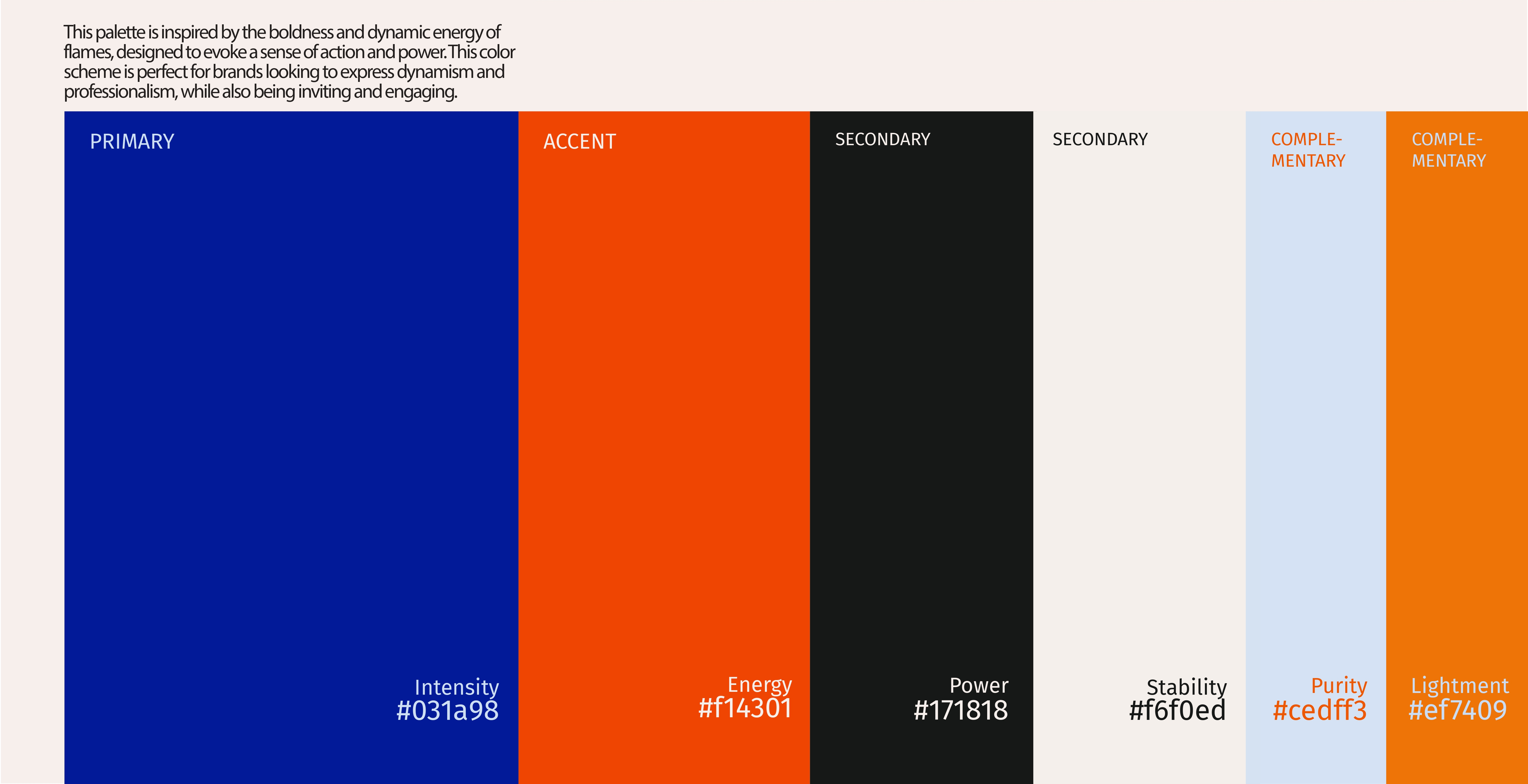
2. Color Palette: The color palette draws inspiration from the concept of flames and ignition, evoking action, energy, and confidence. Featuring deep blue for trust and stability, vibrant orange for energy and innovation, and ember-inspired tones to reinforce the concept of ignition.
3. Typography
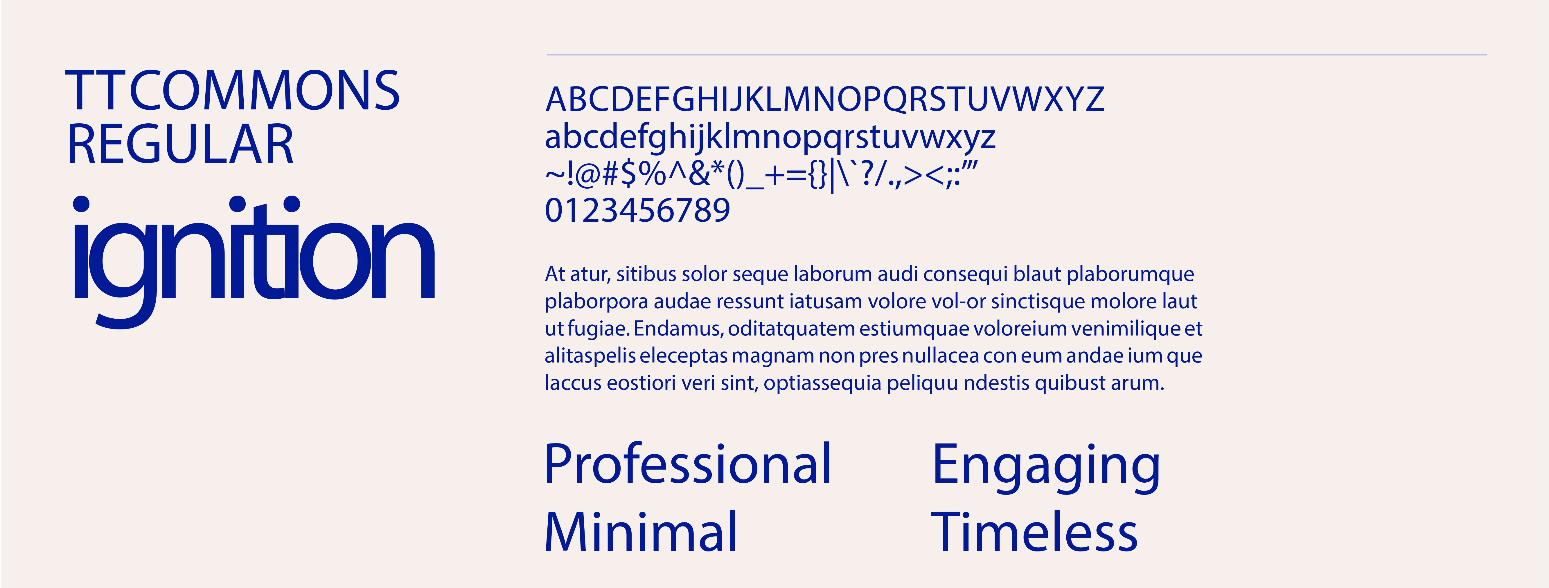
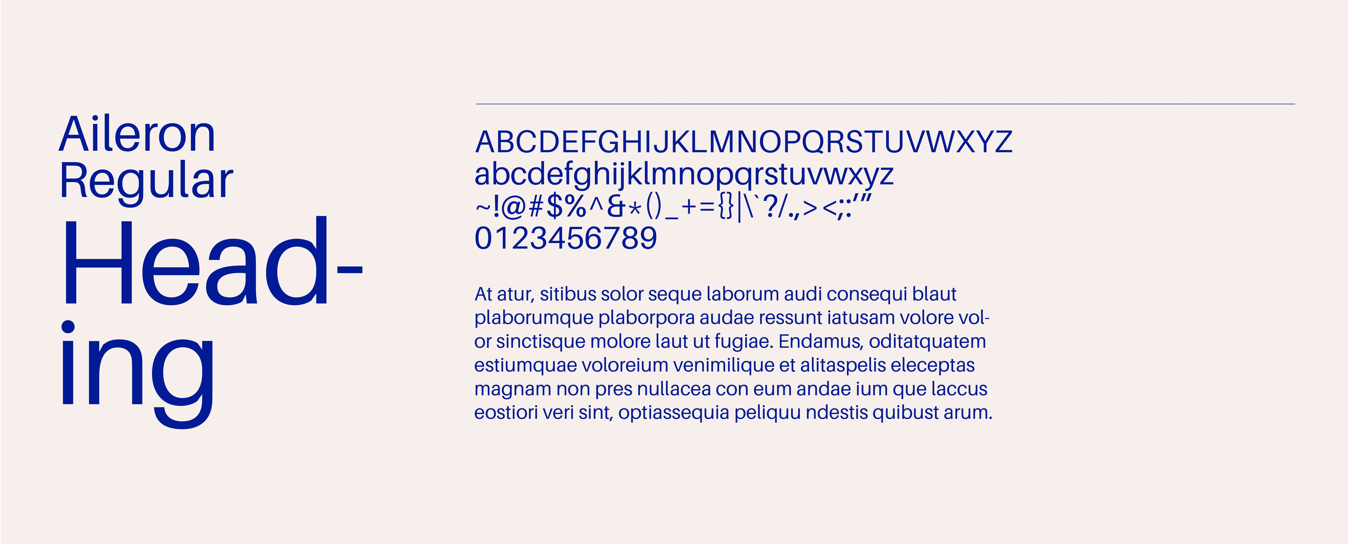
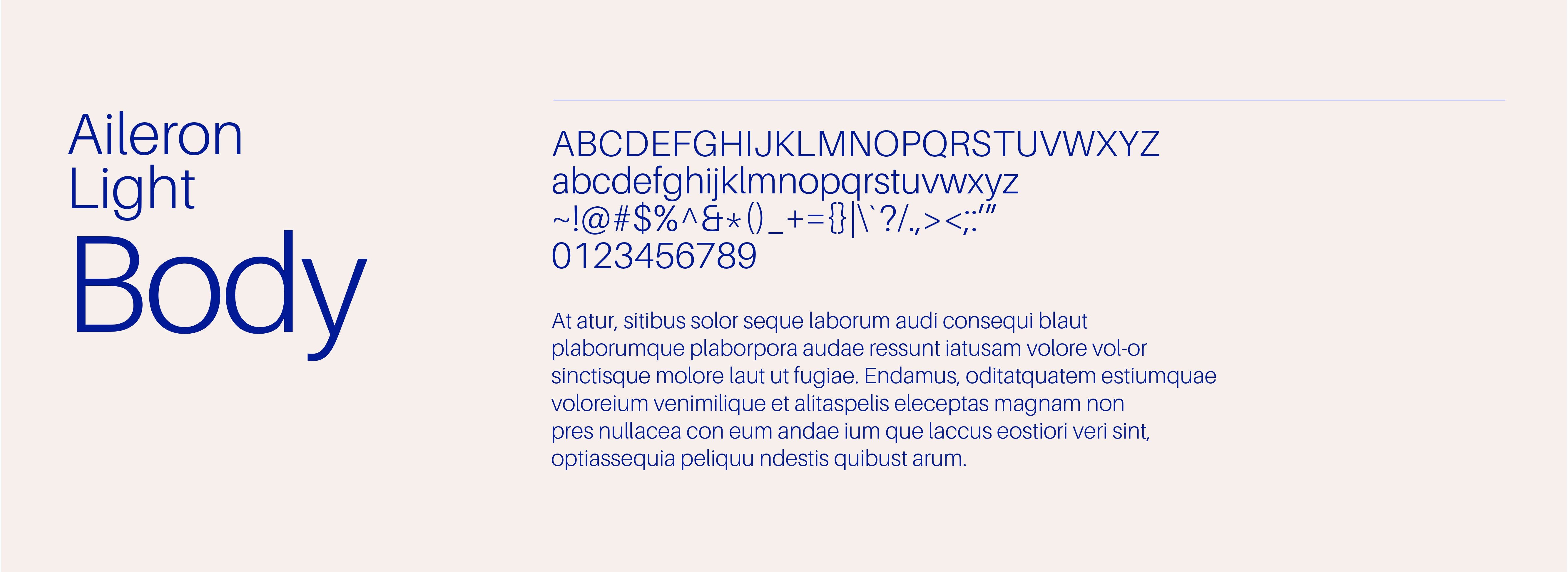
Our choice of typography features a modern sans-serif for headings that conveys clarity and boldness, paired with a clean serif for body text to maintain readability and professionalism. This combination mirrors Ignition’s structured, data-driven approach while keeping communication approachable.
4. Logo Suite Creation
We crafted a comprehensive logo suite to ensure consistency and adaptability across all touchpoints:
- Primary Logo: A striking combination of an arrow and flame icon, symbolizing both structured growth and the energetic spark that Ignition brings to its clients. The logo’s clean lines and balanced composition reflect professionalism and adaptability.
- Secondary Logos: Simplified and versatile versions of the primary logo, optimized for digital, print, and small-format applications.
- Submarks and Icon Variations: Compact and impactful submarks used for social media and branded collateral, maintaining brand recognition in a variety of contexts.
- Wordmark: A refined, text-only logo for use in minimalist branding applications.
This logo suite enhances brand versatility, ensuring a cohesive look across platforms and reinforcing Ignition’s brand presence.
Primary Logo before Primary Logo After

Brand Voice
Brand Voice
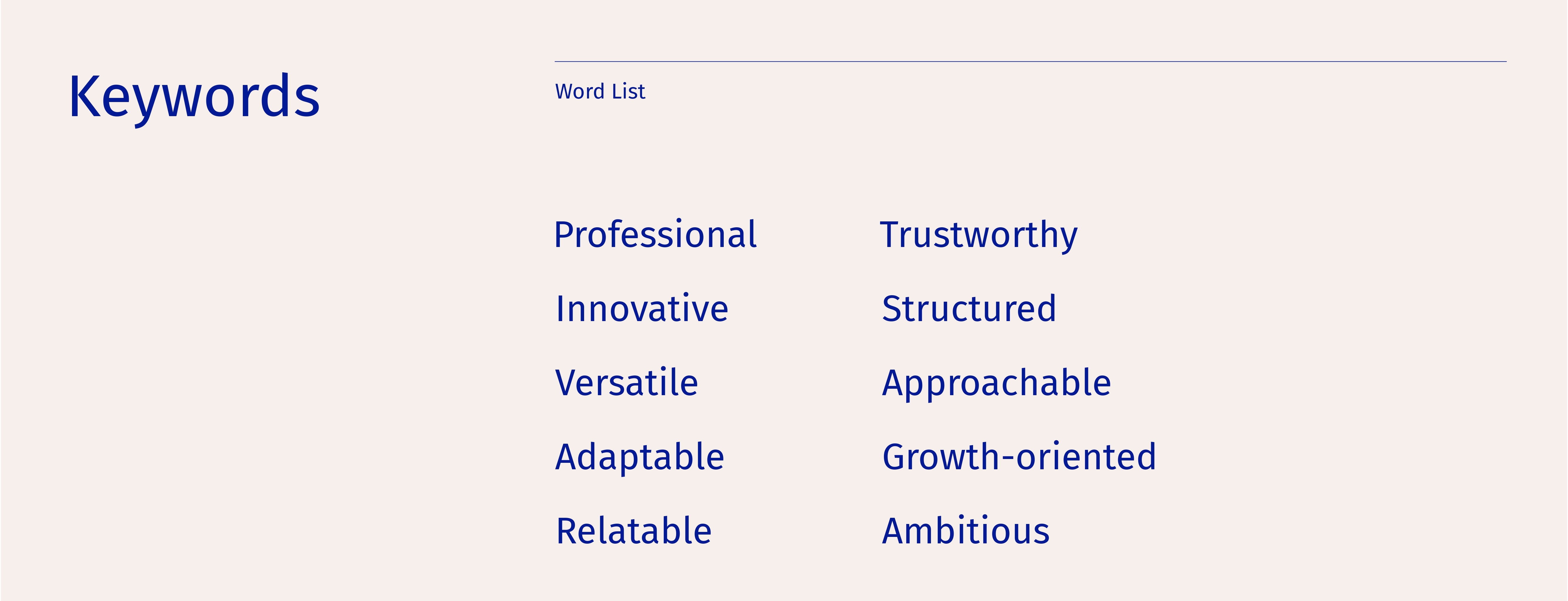
The tone is direct, confident, and engaging—reflecting Jeff’s straightforward, no-nonsense approach. Messaging emphasizes Ignition’s ability to deliver high-impact, measurable results through strategic marketing. It speaks to the unique challenges of growth-focused professionals and positions Jeff as a relatable yet authoritative advisor.
Brand Applications
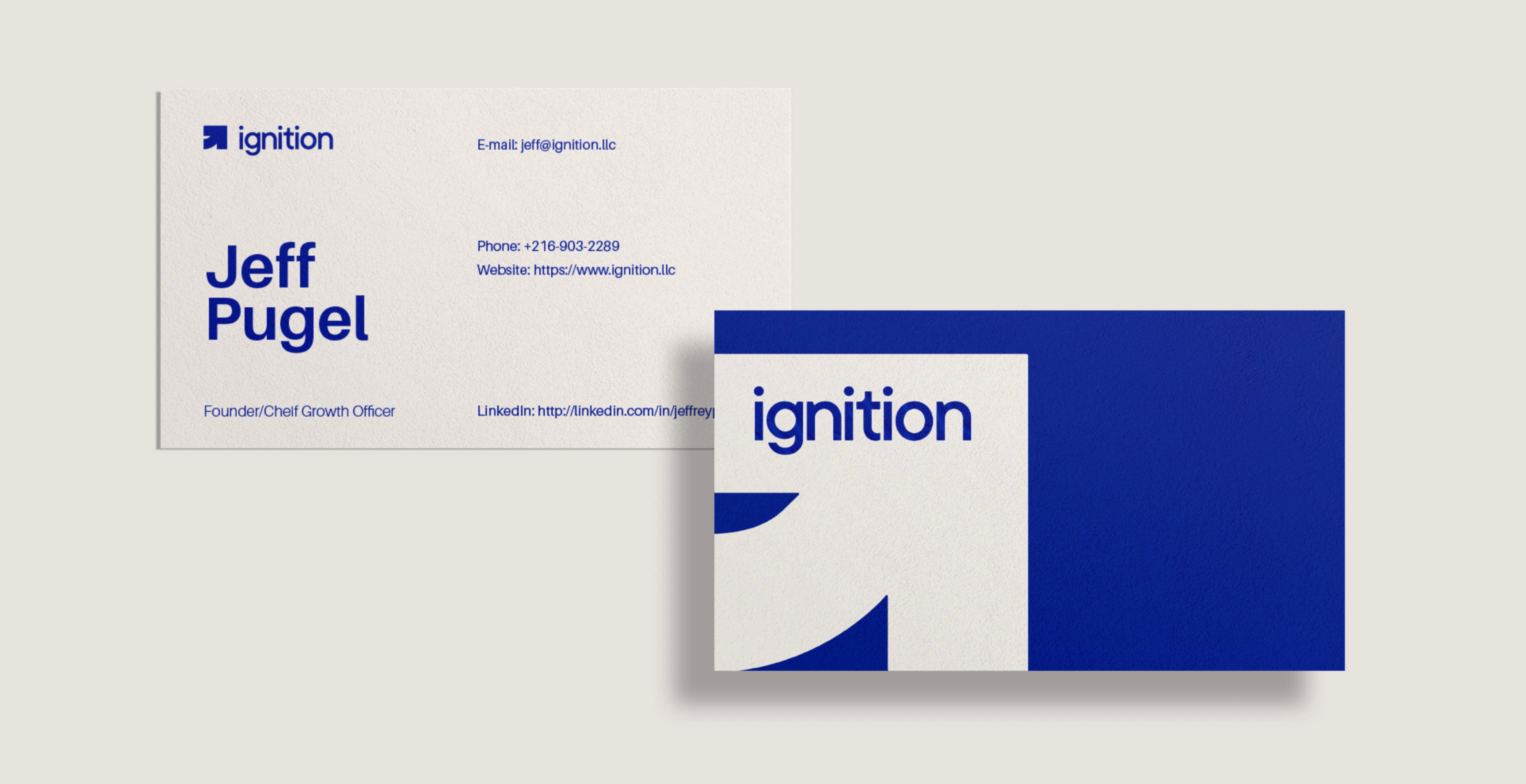
Business Card & Lead Magnet booklet design
Results and Impact
The refreshed brand identity for Ignition LLC positions Jeff Pugel as a leading expert in business growth, enhancing his ability to attract and engage high-value clients. The new visual language and cohesive logo suite reflect Jeff’s mission to transform businesses through strategic, scalable marketing solutions.
Outcomes
- A versatile and visually striking logo suite that strengthens brand recognition.
- A professional, dynamic visual identity that conveys trust, energy, and innovation.
- Increased brand engagement through our lead magnet design.
This case study exemplifies our agency’s expertise in creating brand experiences that embody our clients’ missions, drive engagement, and position them for long-term success.