Exceed in English
Exceed in English – Client Work
Project Overview:
Our agency collaborated with Exceed in English, a dedicated team of language professionals, to create a compelling brand identity that highlights their commitment to empowering students through personalized English language education.

Our Approach
- Logo Design: We crafted a unique logo by combining two E’s and integrating arrows to symbolize “exceeding,” reflecting the brand’s name and mission. The result is a memorable and easily identifiable logo that appeals to all age groups.
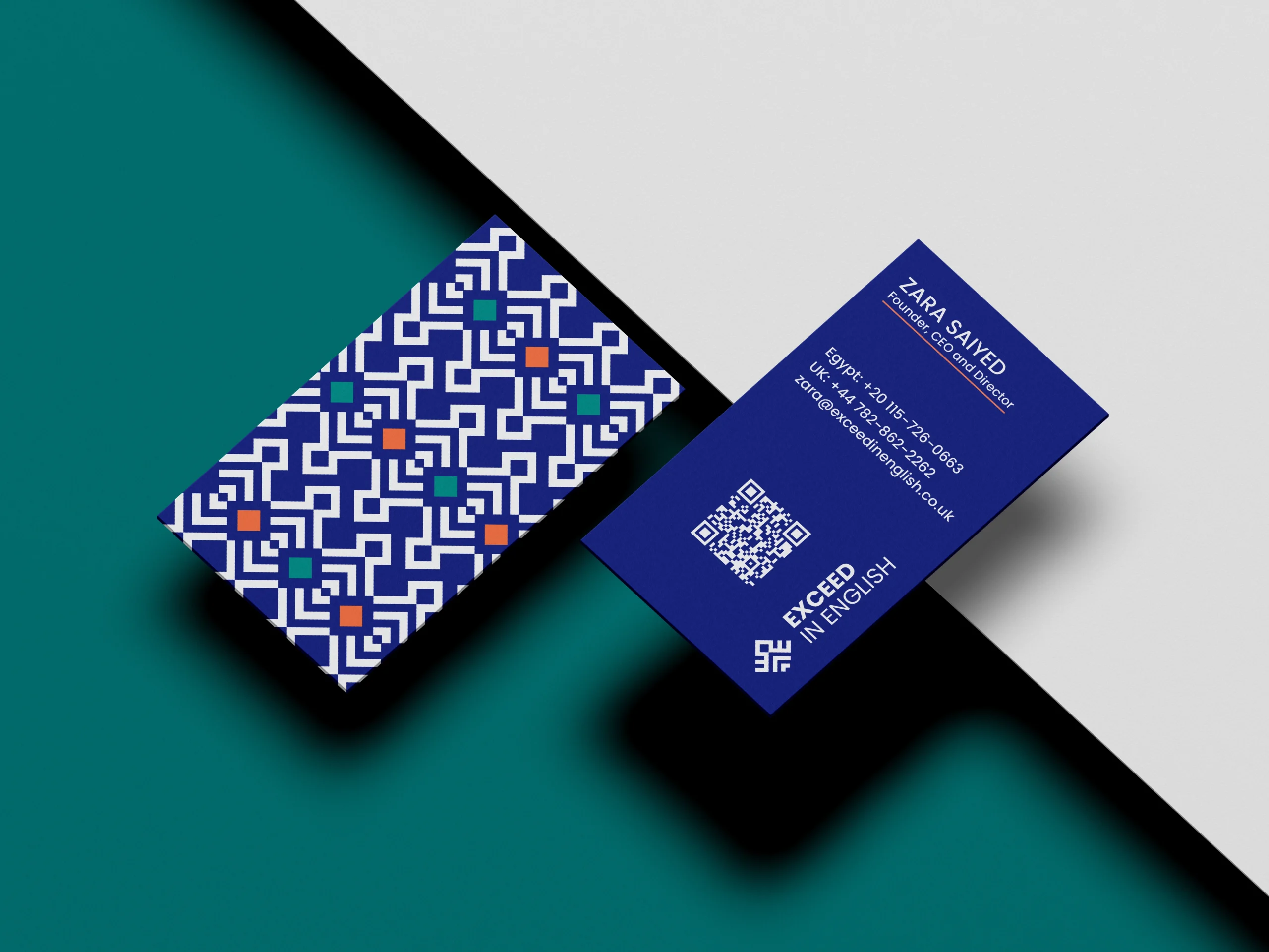
- Color Palette: We selected a deep blue and vibrant green palette to evoke trust, professionalism, and approachability.
- Typography: We chose clean, modern typefaces to ensure readability and convey professionalism across all platforms.
- Brand Guidelines: Comprehensive guidelines were developed to maintain consistency in logo usage, color schemes, and typography, ensuring a cohesive brand identity.
- UX/UI Design: We designed an engaging, user-friendly website that enhances the online experience, making it easy for users to explore services and connect with Exceed in English.

Results
The new brand identity has significantly elevated Exceed in English’s market presence, helping them connect more effectively with their audience and reinforcing their dedication to excellence in language education.

